Underground App Case Study
The aim of this project is to design an app that allows people to use their smartphone as underground cards. It also provides juicy data in real time.
The aim of this project is to design an app that allows people to use their smartphone as underground cards. It also provides juicy data in real time.
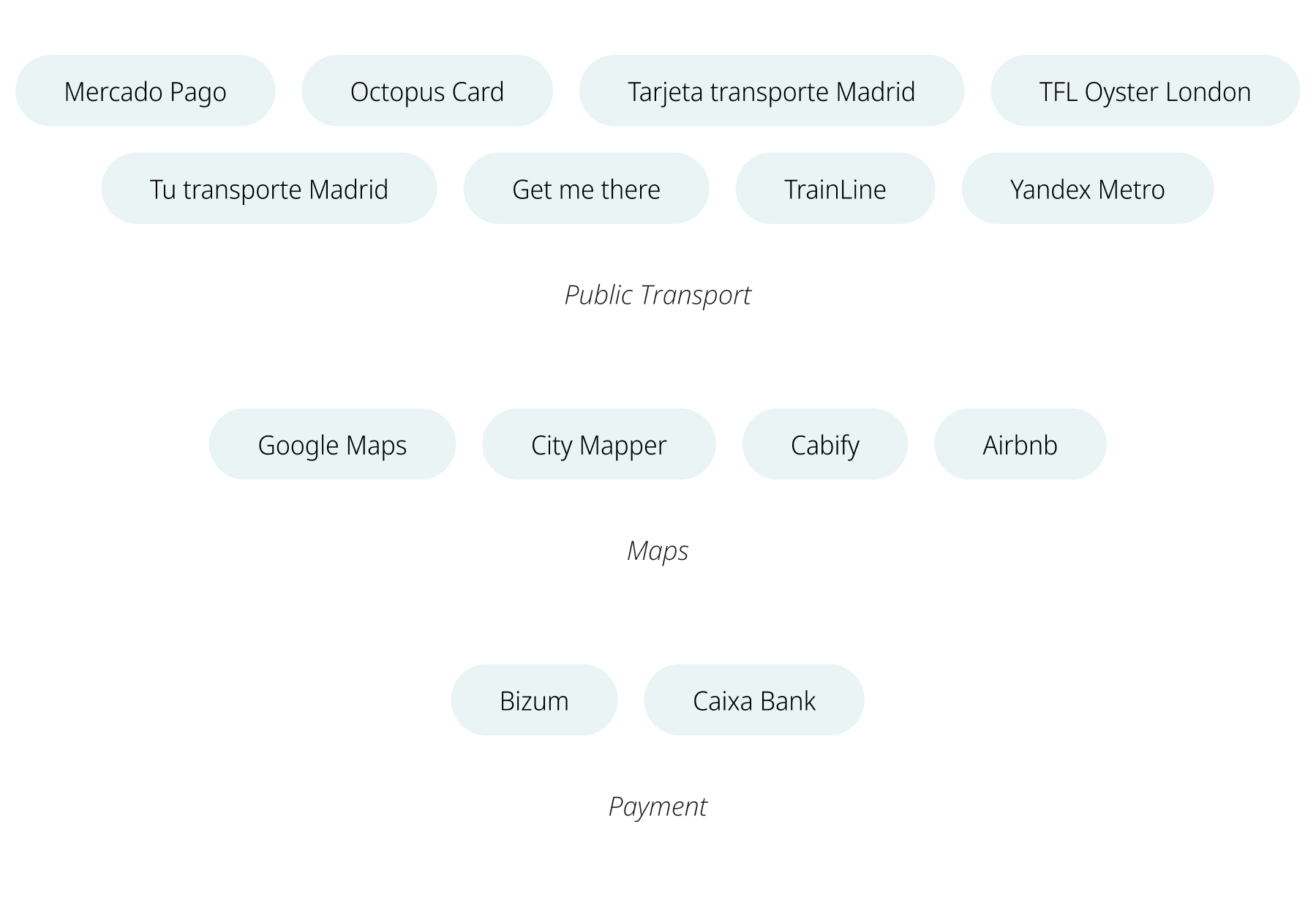
The Quick Benchmarking was one of the most important method to understand the problem and see possible solutions and how to develop them. I searched for different apps to detect best, good and bad practices.
I discovered that there was a huge possibility to stand out from the competitors if the search function of stations, lines and routes, and the map were simplified in one screen. Furthermore, the control of multiple cards in one app would be a strong idea.
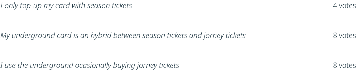
This phase was focused on understanding user behaviours, needs and motivations. I have used some techniques and metodologies such as User Personas and Surveys. On the one hand, I discovered that I should divide the customers into two different groups: Frequent customers using season tickets and casual ones using pay as you go top up. I also divide the problems into 2 groups: related to top up (before travelling) and related to the map (before and while travelling)
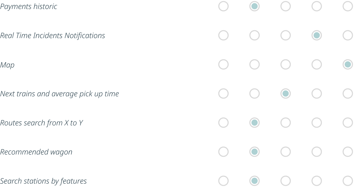
I decided to do a survey. The aim of it was to detect the best functions, to prioritize them and listen to suggestions. I asked 20 different people to answer 3 quick questions explaining them the aim of the project.

I. Select the sentence that represents you the best
II. Rate the following extra functions in an Underground App from 1 (Not important) to 5 (Very Important):
III. Coments, suggestions, thoughts:
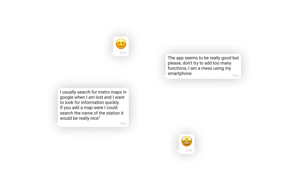
The conclusions of the survey were that many users have to top up different types of tickets. It is important to keep it in mind to make a clear top up screen. On the other hand customers prefer to have a clear and well desined app with only the main features and some interesting extra ones ( map and real time incidents)
I used a MoSCoW to sort tasks by priority. It was useful to discard the unnecessary ones and highlight the vital product needs. For example, I discarded the street map feature because I prefered to focus in other functions that could stand out more from the crowd.
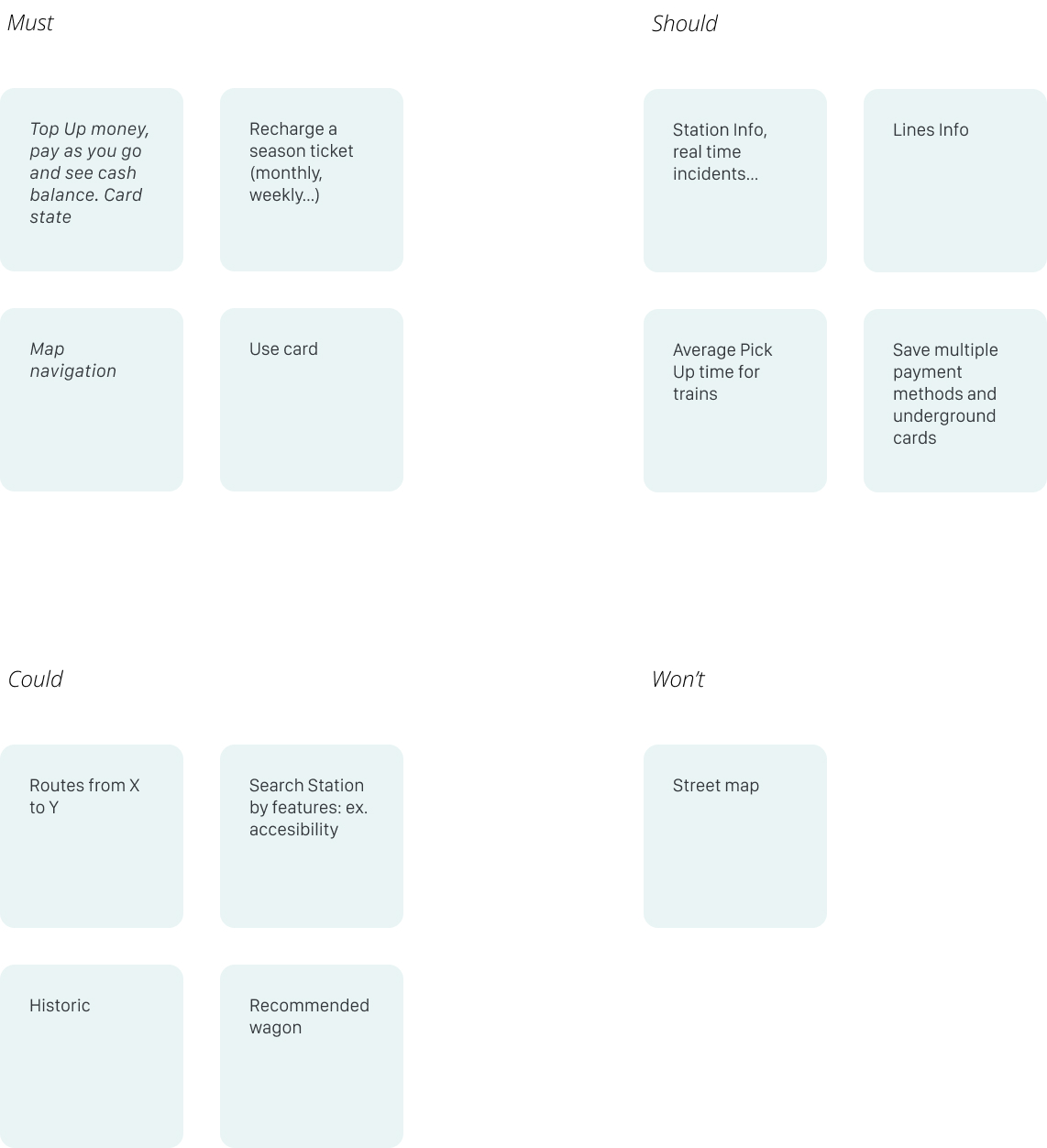
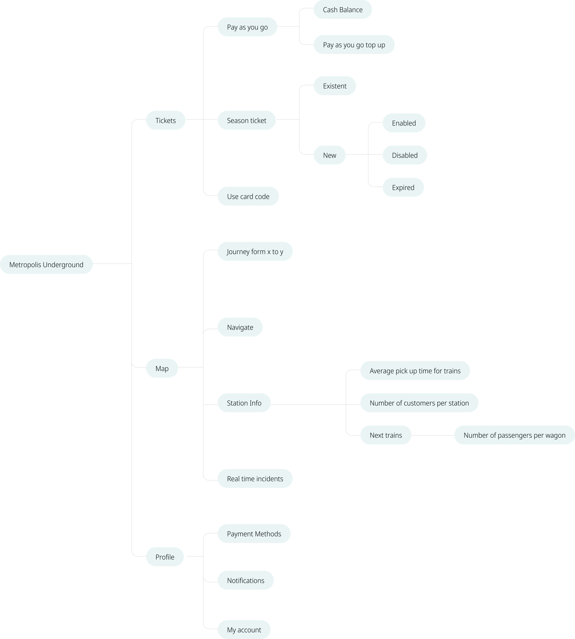
After doing the MoSCoW I organised the functions into two groups: the ones related to the top-up card and the ones related to the map. Furthermore I made a list of necessary settings.

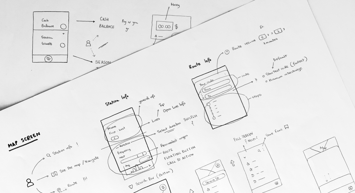
Ideas started been more tangible and I took some important decisions: For example, I decided to display favourites and recent searches next to the search bar in the map screen, because many people usually plan similar routes.
The goal of the visual appearance is to transmit a feeling of security, modernity and cutting-edge technology.

I have defined different types of action buttons and cells deppending on their importance. The app has also been evaluated for contrast standards. I have checked the elements with ‘A11y - Color Contrast Checker’ Figma Plugin and some colors and font weights have been modified. I have used ‘Color Blind Simulator’ Figma Plugin to design an app that does not only deppend on colors but also on shapes and weights.

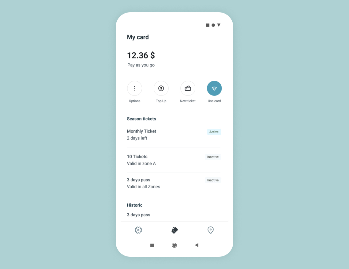
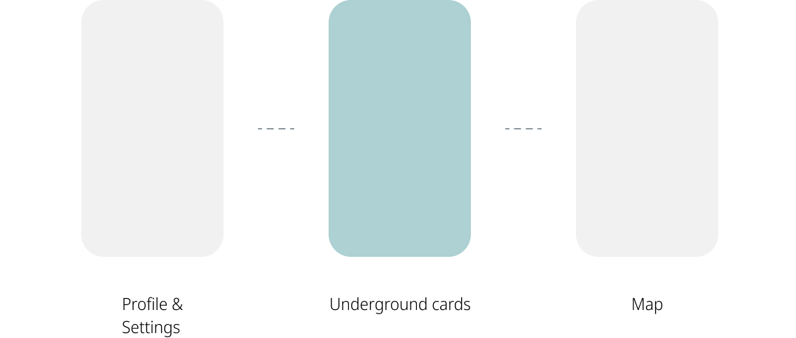
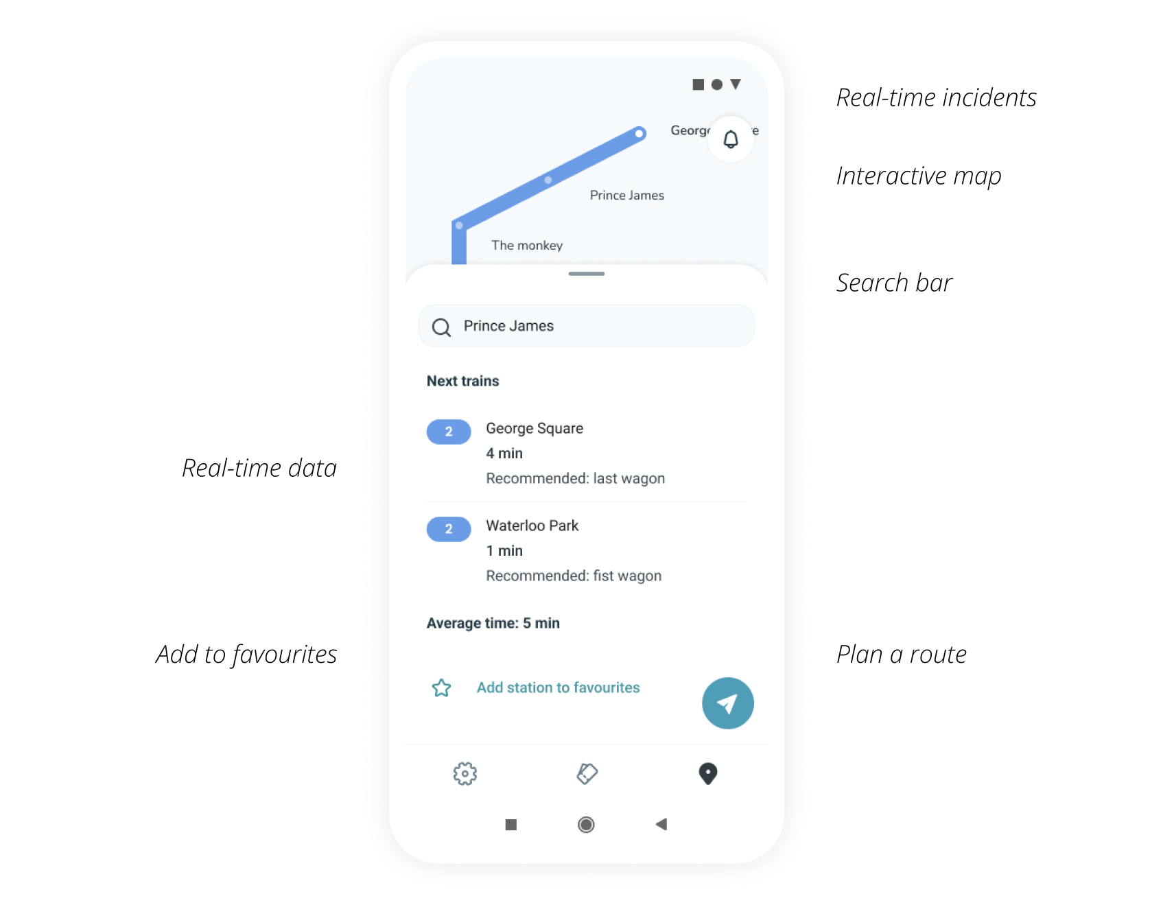
Customers can use their smartphones as underground cards just by tapping on ‘Use Card’ button. Payment methods could be saved and customers can top-up their cards in a few steps. Furthermore, there is a map screen which sums up all the extra information realted to stations, lines and journeys
The app allows users to top up and use their smartphones as underground cards. The result is that they spend less time doing it and their satisfaction using the underground increases.